Issue 11: The Complete Guide to Cyber Risk Dashboard Design
Lies, Damn Lies, and the Numbers That "Feel Right"

In This Issue:
📖 Book Update
🎤 Upcoming Talks
📝 The Complete Guide to Cyber Risk Dashboard Design
📖 Book Update
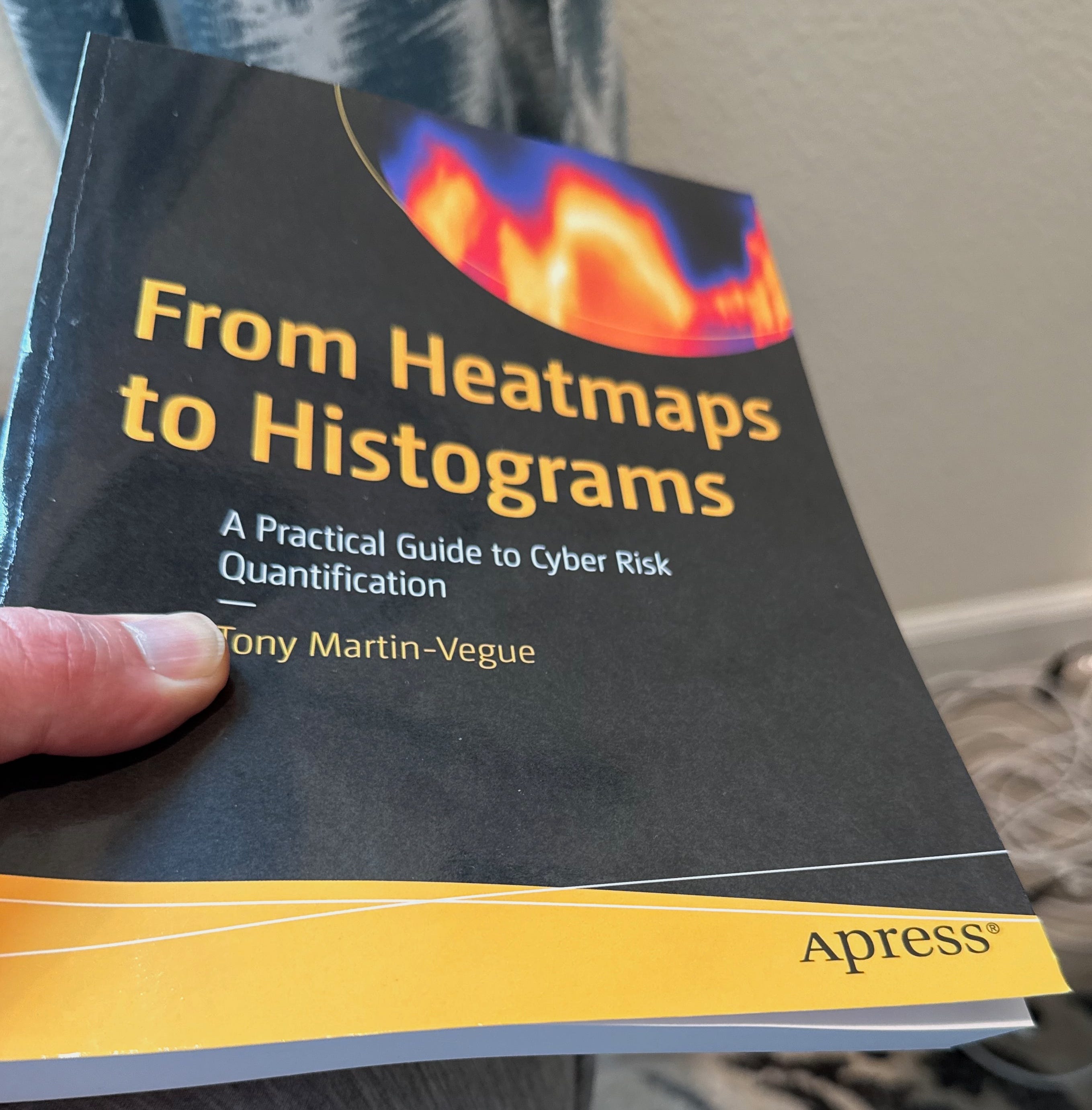
Hey, it’s here! It’s in my hand! My book, From Heatmaps to Histograms, just arrived on my doorstep from Springer Nature. It’s an amazing feeling that I don’t really have words for. It’s been quite a journey, to say the least. In the book, I call risk measurement and quantitative analysis a “quiet revolution” of rational thought, so as it goes out into the world it feels “done” in a sense, but it also feels like a beginning. I keep coming back to this quote from T.S. Eliot, one of my favorite poets:
What we call the beginning is often the end. And to make an end is to make a beginning.
Here is where things stand with orders and shipping as of April 1:
The book is available worldwide, anywhere books are sold, online and in local bookstores
Available now via the publisher, Springer — ebook $29.99, print $39.99
Available now via Barnes & Noble — ebook and print $39.99, I am hearing that orders through B&N have shipped
Still on preorder via Amazon 🤷♂️ — print $39.99, showing an April 9 date, but I would imagine copies ship within a few days
Book signings and events are in the works, and I’ll share details as they come together.
As you get your copies, please send me pictures. I would love to post them on LinkedIn. If you leave a review, which helps enormously, let me know, and I will share it. And thank you to everyone who preordered.
🎤 Upcoming Talks
April 21, 2026 — “Did We Solve the Data Problem? Judgment, Beliefs, and Risk in the AI Age” SIRAcon 2026 — Keynote
I’m keynoting SIRAcon this year with a talk on why the real bottleneck in risk quantification was never data, it was judgment, and why AI makes that distinction more important than ever. SIRAcon remains my favorite conference because it is model-neutral, vendor-neutral, and entirely dedicated to advancing risk practices.
📝 The Complete Guide to Cyber Risk Dashboard Design
This issue is a masterclass in building the ultimate cyber risk dashboard. I’m going to teach you how to build the example below, which has every critical element a risk team needs to present to executive leadership:
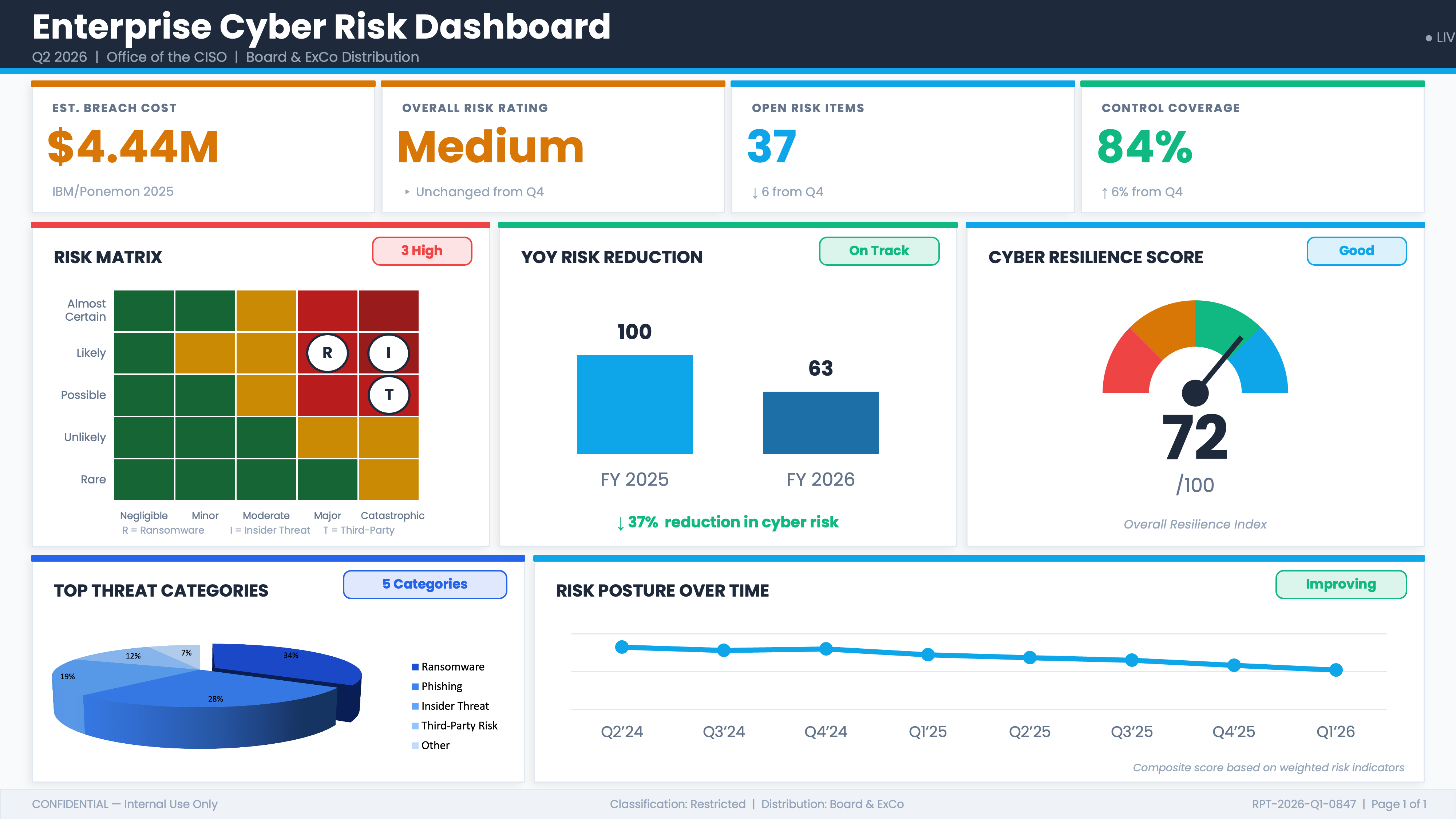
A peer benchmarking figure from the IBM/Ponemon Cost of a Data Breach Report, a trusted source that gives you a perfect baseline for what a data breach would cost your organization
An aggregated cyber risk rating across all risks and portfolios, so leadership has a single clear picture of where we stand
Control coverage and open risk items, the operational metrics every board wants to see
The centerpiece: a risk matrix showing your top risks for quick, easy decisions on where to focus mitigation efforts
A 3D pie chart of top threats for fast visual recognition
And much more….
ꜜ
April Fools.
I hope I didn’t give everyone a heart attack. You probably thought I lost my mind. The real topic of this issue is a walkthrough of very common data visualization and measurement techniques, how they can be misused or misinterpreted, and what the better alternatives look like.
What is entirely absent from this dashboard, before you look at any individual element, is any statement of purpose. There is no decision it is designed to support, no organizational objective it connects to, and no decision-relevant question a board member could answer after reading it that they could not have answered before. The dashboard is a collection of indicators assembled because indicators can be assembled, a snapshot of activity presented as “risk.” When a dashboard has no decision to serve, there is no principled way to ask whether any given metric belongs on it at all.
A dashboard that tells you what happened is a report. A dashboard that tells you what to do requires a decision at its center, and this one has none.
Hubbard defines measurement as a quantitatively expressed reduction in uncertainty based on one or more observations. By that standard, not one element on this dashboard qualifies as a measurement. Each one fails on at least one of four criteria: it lacks a defined construct, it has no unit, it is not reproducible across observers, or it has no demonstrable connection to the phenomenon it claims to represent.
Let’s dive in, one at a time.
① $4.44M: The Wrong Number from the Wrong Companies Measuring the Wrong Thing
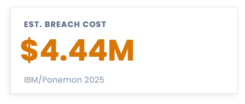
I have seen this figure used two ways, and both are wrong.
Using it as a proxy for your projected breach cost: “if we have a breach, it will cost us $4.44M on average.”
Taking the per-record figure from the same report and multiplying it by the number of records at your organization to produce a “personalized” breach cost estimate. The report’s own FAQ section explicitly states that the per-record cost cannot be used this way, because the study only covers breaches up to 113,620 records, but people still do it. All the time. (Who reads the fine print, anyway?)
Neither approach is defensible, and you should not use Ponemon figures for either purpose. The methodological problems with this report could fill an entire issue (and I will probably do that at some point), but here are the three that matter most:
The sample is non-scientific. The report surveys 600 organizations that experienced a breach, selected in a way that is, by the report’s own admission, “biased toward organizations with more mature privacy or information security programs.” Your organization may look nothing like that population, and because the sample is non-scientific, the results cannot be extrapolated to your organization.
The cost data is estimated, not measured. Ponemon asks individuals to estimate their breach costs after the fact using activity-based extrapolation, and the report acknowledges this may introduce bias and inaccuracies. A survey is not the right instrument for gathering this kind of data.
The headline figure conceals enormous variance. The US average in 2025 was $10.22M. Healthcare averaged $7.42M. Retail averaged $3.54M. Public sector averaged $2.86M. A single global average summarizing those figures tells you almost nothing useful about any of them, and averaging a distribution this wide is a flaw of averages in its own right.
For next time: If you need a benchmark figure, the Cyentia Institute’s IRIS 2025 report is built on more than 150,000 real cyber incidents spanning fifteen years of empirical loss data, segmented by sector and organization size. Unlike Ponemon, it is not survey-based. You can get a credible, defensible range calibrated to your revenue band and sector. Disclaimer: I am a Fellow at the Cyentia Institute, but I was advocating for this data long before that relationship existed.
② “Medium”: A Label That Cannot Be Computed
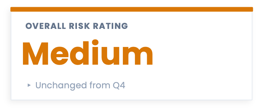
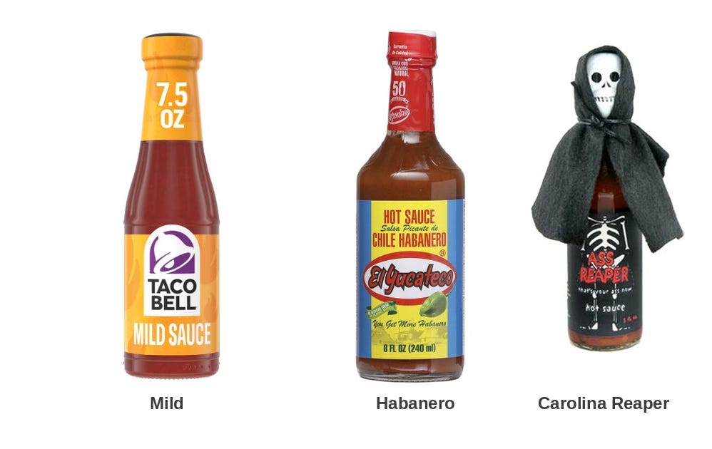
Think about ten hot sauces lined up on a table, ranging from almost ketchup to face-melting. You could rank them from mildest to hottest. What you could not do is average them into a single meaningful spiciness score, because the distance between each level is undefined. The gap between a Tabasco and a habanero is not the same as the gap between a habanero and a Carolina Reaper, and no amount of arithmetic on your ranking will tell you that.
This is exactly what happens when you take a portfolio of risks rated High, Medium, and Low and collapse them into a single aggregate rating. The “Overall Risk Rating: Medium” on this dashboard is not a measurement of anything. It is an artifact of an operation that should not have been performed. Ordinal scales encode rank order only, saying nothing about the distance between levels. You can sort them, but you cannot add them, average them, or combine them into a summary figure.
Then there is the label itself. Consider what a leader is supposed to do with the word Medium. There is no defined threshold, no probability, no magnitude, and no financial unit attached to it. Someone decided this was Medium rather than High or Low, and that decision implies a process, but the process almost always involves additional undefined terms: likelihood judged on a five-point scale, impact estimated against vague categories. Undefined inputs produce undefined outputs, and the label that emerges carries the weight of a decision without the substance of one.
The sub-label reads “Unchanged from Q4.” The absence of change is being presented as a finding worth reporting.
For next time: A label that connects to a decision tells a different story. “There is a 35% probability of a loss event exceeding our $5M retention threshold in the next 12 months” is a statement that means something. It tells you whether to buy more insurance, change your controls, or accept the exposure, and it gives leadership an actual basis for a conversation.
Borrowing from finance, a quantitative approach also opens the door to a genuine portfolio view of risk, one where the results of individual scenario analyses can be legitimately aggregated, because you are working with probabilities and loss ranges rather than ordinal labels. The math is valid in a way that averaging Highs and Mediums simply is not. That said, I do not personally recommend collapsing a risk portfolio into a single aggregate number either, for reasons I covered in a reader question a few issues back. The portfolio view is most useful when you can see the individual scenarios and their relative contributions, not when they disappear into another composite score.
③ 37 Open Risk Items: You Cannot Close the Future
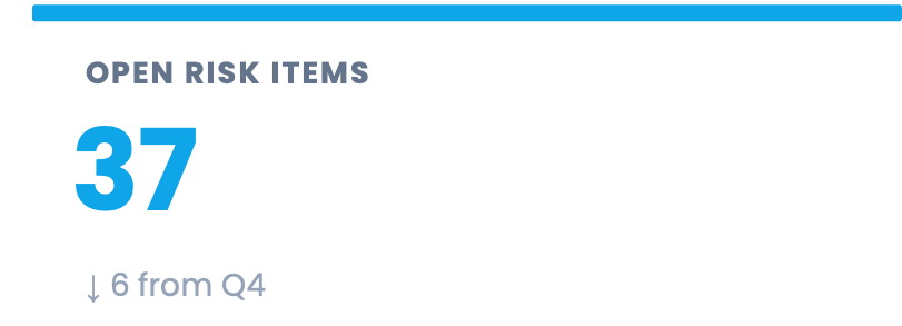
Of everything on this dashboard, this one may be the hardest to let go of, even for practitioners who have been doing quantitative risk analysis for years. The open/close model is not a simple rookie mistake. It is a way of thinking that runs through incident response and almost every other operational process in security. It also feels good; it feels productive in a way that probabilistic thinking sometimes does not, because closing a ticket is a visible act of completion.
The problem is that it rests on a logical error. A risk is not a task. It is a statement about the future: given what we know about our environment, our controls, and the threat landscape, there is some probability that a loss event will occur. You cannot fix that and close it. You can change your controls, accept the exposure, transfer it to an insurer, or decide the scenario is outside your scope, but none of those actions make the future go away. The probability changes. The scenario does not disappear from the register because someone marked it resolved.
When a risk register behaves like a ticketing system, the incentive follows: teams work to close items rather than to reduce exposure. A risk that gets closed without any corresponding change in the probability or magnitude of loss is a risk that got administered, not managed. The count goes down, the dashboard looks better, and the organization’s actual exposure is unchanged.
The 37 is not a measurement of risk. It is a count of tickets.
For next time: A risk register entry should persist as long as the scenario is plausible, updated as the threat environment and your controls change. The number worth tracking is not how many items are open but whether the probability and expected loss for your top scenarios are moving in the right direction, and by how much.
④ 84% Control Coverage: Coverage of What, Exactly?
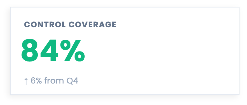
Coverage metrics are legitimate. Knowing whether a control is present is a valid input to vulnerability estimation, and FAIR practitioners use control presence as part of probabilistic risk analysis all the time. The interesting question is what coverage means when it is aggregated across a generic framework checklist and presented as a standalone indicator of risk posture.
At that level of abstraction, 84% cannot be converted to a probability, an expected loss, or a decision. The question it answers is “what percentage of framework line items are checked,” not “how much have we reduced the likelihood or magnitude of our top loss scenarios.” Those are different questions, and only the second one carries much weight in a board conversation.
A 16-point gap in a framework checklist could represent almost nothing, or it could represent the specific controls most relevant to your highest-consequence scenarios. The coverage percentage cannot tell you which, because it was never anchored to scenarios in the first place. Aggregate coverage against a checklist, with no scenario weighting, has no reliable relationship to scenario-specific loss reduction, and without that connection, the number has nowhere to go.
For next time: Anchoring coverage to scenarios changes the conversation entirely. “Our ransomware scenario controls are 94% in place, reducing expected annual loss for that scenario from $8.4M to $5.1M. Closing the remaining gap to 99+% would cost $600K and reduce expected loss by a further $1.2M” is a coverage metric that connects directly to a decision about where to invest next. The percentage is still there, and now it means something.
⑤ The Risk Matrix: A Math Crime Dressed in Traffic Light Colors
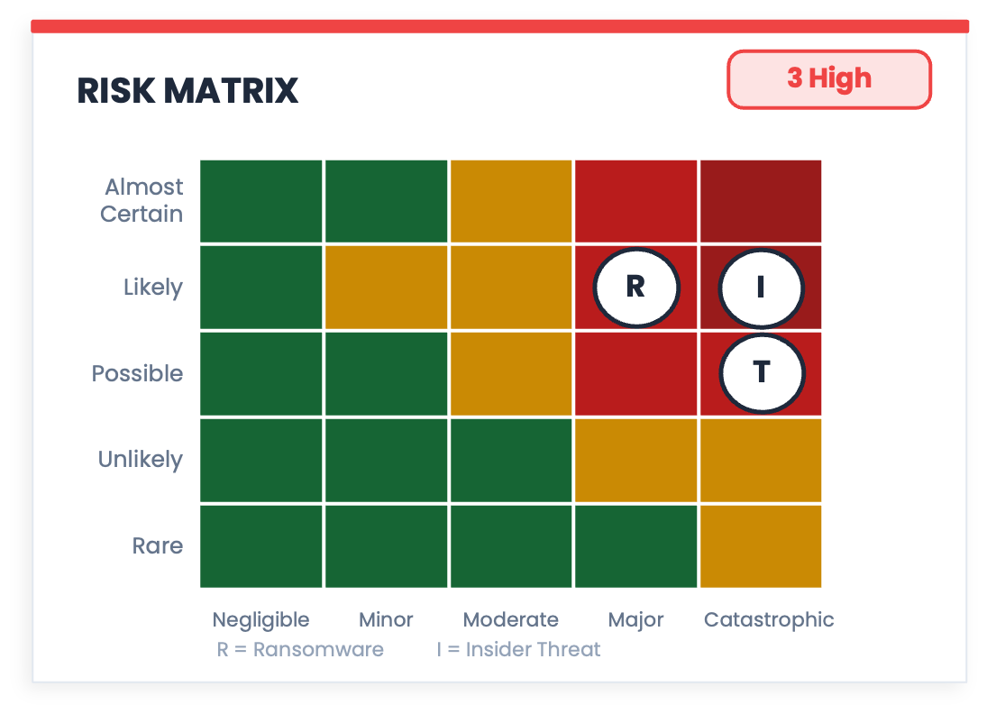
Look at this chart for a moment before reading anything else. It has a grid, coordinates, color-coded zones, and named threats plotted at specific positions. It looks exactly like something that was calculated. That appearance is the problem.
The risk matrix is the most visually convincing measurement instrument in security that doesn't measure anything, and there is a substantial body of research to back that up. A good summary of that literature can be found in Hubbard’s The Failure of Risk Management, but the three core problems are worth unpacking here because they are not obvious from looking at the chart.
The ordinal scale problem. You already know this one from the hot sauce problem above. Likelihood and Impact in a risk matrix are ordinal scales: they encode rank order only, saying nothing about the distance between levels. “Likely” is ranked above “Possible,” but by how much? Nobody knows, because the scale does not define it. You could relabel the five likelihood levels as 1, 7, 103, 500, and 8,000,000 and the ranking would be identical, but the positions on the grid would be wildly different. Any arithmetic that combines those levels is operating from faulty logic, and the grid coordinates that result are meaningless as a consequence.
Range compression. A 5x5 matrix has 25 cells, which means every risk your organization faces gets forced into one of 25 buckets. A 3x3 grid obviously has even fewer buckets. A scenario with a 15% probability of occurring lands in the same cell as one with a 24% probability. A loss of $800K looks identical to a loss of $4M if they share a cell. The matrix not only fails to capture that variance; it actively hides it, which means the decisions made from it are based on less information than the underlying analysis contains.
False precision. This is the one that makes the other two worse. Because the matrix produces a position, a color, and a label, it creates the appearance of a calculated result. The grid implies that something was measured and plotted. The colored zones imply that the boundaries between them were defined. None of that is true, and the visual language of the chart makes it harder to notice, not easier.
For next time: Probability and loss ranges per scenario give you something the matrix cannot. “Ransomware: 60% probability, $2M to $9M expected loss range” is a single row of a table. It is less dramatic than a 5x5 grid and considerably more useful, because it is a format that connects directly to a decision.
⑥ 37% Reduction in Cyber Risk: A Semi-Attached Figure
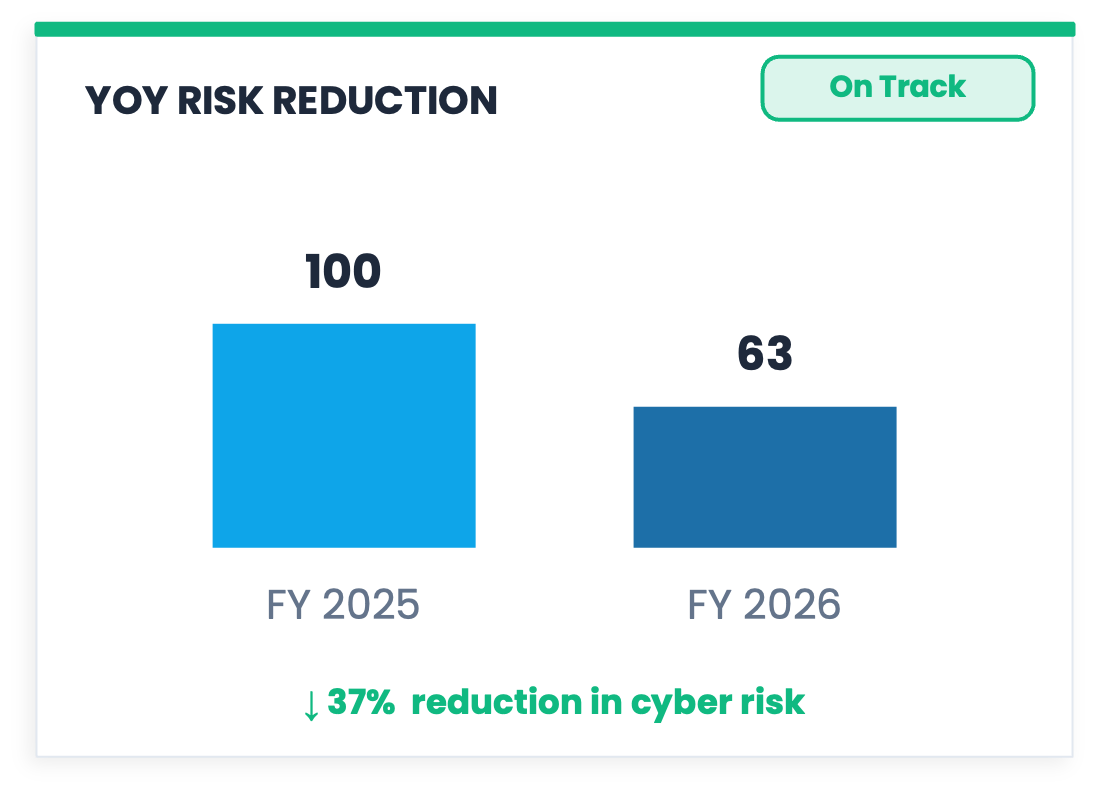
You finish a long run, step on the scale, and you are down three pounds. The number is real and it went in the right direction, but it is measuring sweat and fluid loss, not fat. You did not get three pounds leaner. The scale measured something real, just not the thing you wanted to know.
Darrell Huff called this the semi-attached figure in the classic book How to Lie with Statistics, and the 37% reduction on this dashboard is a textbook example. The bar chart shows a reduction in “Risk Score.” Risk Score is a composite of weighted indicators whose components and weights are not defined anywhere on the dashboard. The reduction of 37% tells you that a number went down, derived from other numbers, combined in a way that is not disclosed. Before you can measure a reduction in X, you need to define what X is, and “cyber risk” as expressed by an undisclosed composite is not a defined construct. The 37% is not a measurement of risk reduction; it is a measurement of a score that was named after something. The further you trace the number back, the further you get from the thing you want to know, which is whether the organization is less likely to suffer a material loss than it was a year ago.
“On Track” sits in a badge in the corner. Toward what, though? There is no target state anywhere on the dashboard, no defined destination, and no criterion for what “arrived” would look like. The chart is reporting progress toward a place it has never described.
For next time: Define the target in real units first. “We aimed to reduce the probability of a loss exceeding $5M from 40% to 25% and are currently at 31%” is a bar chart that works well here because it attaches the figure to the thing you are trying to manage.
⑦ 72/100 Cyber Resilience Score: Goodhart’s Law in a Speedometer
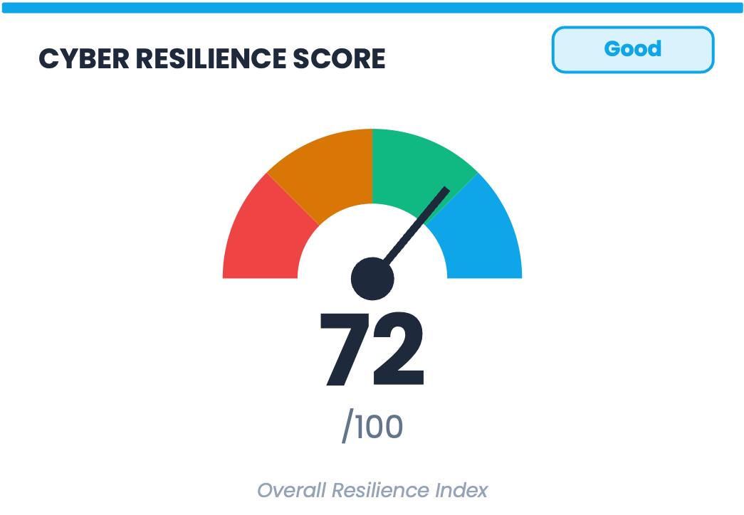
There is a principle in economics called Goodhart’s Law: when a measure becomes a target, it ceases to be a good measure. When organizations find ways to move the number they are being measured on, the connection between that number and the underlying reality it was meant to represent loosens.
A cyber resilience score on a board dashboard is close to an ideal Goodhart trap. It is visible, it is tracked quarter over quarter, and it is labeled Good or Needs Improvement in terms that make optimization feel like progress. A score that can be influenced by checking off controls or shifting which inputs get counted, without any corresponding reduction in the actual probability or magnitude of loss, will reliably go in the right direction while telling you nothing about whether the organization has become more resilient in any meaningful sense.
The speedometer graphic makes this worse. The gauge is borrowed from physical systems like fuel levels and engine temperature, where the underlying measurement is real, continuous, and directly connected to what the needle is showing. Resilience has none of those properties, and the visual language of the gauge implies a precision and directness that the composite index behind it cannot deliver.
Underneath all of this is a measurement problem that the design problem obscures. When you aggregate heterogeneous indicators into a single number, you lose the information that would tell you how to act. For example, if your temperature, your blood pressure, and your white cell count are each concerning, a composite health score of 68 does not tell you whether to take aspirin, call a cardiologist, or start antibiotics. The more interesting question is what decision changes if this score is 68 instead of 72. That question has no answer, because the score was never meant to have one. It was designed to communicate that things are being monitored, which is a different purpose and a lower bar.
For next time: The metrics that compose a score are almost always more useful than the score itself. “Ransomware scenario: 60% probability, $3.2M expected annual loss. Closing the top three control gaps would reduce expected loss to $1.8M.” Three numbers, each in a unit that means something, each connected to a decision. That is what disaggregation looks like on a board slide.
⑧ The 3D Pie Chart: An Optical Illusion with a Data Problem
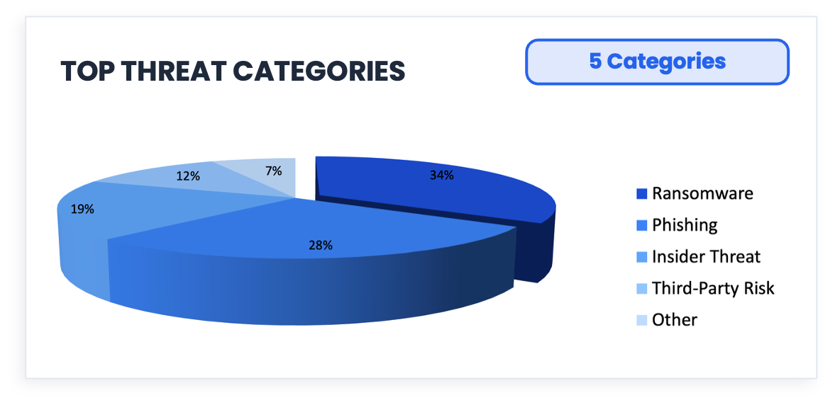
Phishing accounts for 28% of the data. Now look at how much of the chart it appears to occupy at the front of that tilted disk. It occupies more space than Ransomware, which is 34%.
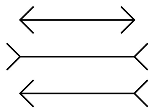
Before we get to the chart, look at the three lines above. They are identical in length. Your visual system insists otherwise, because it is responding to the arrow geometry rather than the actual measurement. This is the Müller-Lyer illusion, and it is not a quirk or a trick that careful observers can avoid; it’s just how human vision works. The visual system applies depth cues automatically and universally, and almost always gets this wrong.
The 3D pie chart exploits exactly the same mechanism. What you are seeing when you look at that Phishing slice is Tufte’s Lie Factor in action: the ratio of the size of the visual effect in a graphic to the size of the actual effect in the data. A Lie Factor of 1 means the graphic represents the data faithfully, and a Lie Factor greater than 1 means the graphic is exaggerating. The 3D pie chart structurally cannot achieve a Lie Factor of 1, because the perspective projection that creates the illusion of depth physically inflates front slices and compresses back slices independently of what the data says. Rotate it 180 degrees, and Phishing would appear to be much smaller, with the data unchanged and only the geometry different.
3D Pie charts persist because they are intuitive and available in every charting tool. Nobody ever got fired for using one (that I know of). However, intuitive and accurate are not the same thing, and this one is working against you.
For next time: A horizontal bar chart lets the eye compare lengths along a common baseline, which is the one perceptual task humans perform with any reliability. The comparison is immediate and exact; the 3D pie requires you to estimate it through distorted geometry.
⑨ Risk Posture Over Time: Improving Relative to Nothing
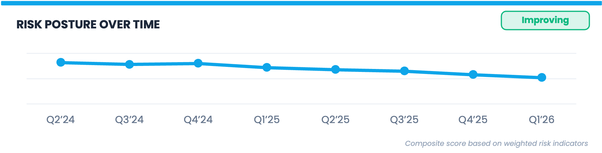
The trend line descends from 82 to 52 across eight quarters, the footnote reads “Composite score based on weighted risk indicators,” and the label over the chart reads “Improving.”
The word “Improving” is doing a lot of heavy lifting on this chart. The organization’s own prior score on an undefined composite index went down, but threat actors did not stand still during those eight quarters. Ransomware groups got new tools and techniques, supply chain attack surfaces expanded considerably, and AI-assisted phishing scaled to the point where generating a convincing attack email dropped from hours to minutes. A score that improves monotonically through eight quarters of a changing threat landscape may indicate that risk declined, maybe via reductions in frequency or magnitude, or both, or it may indicate that the measurement system is insensitive to the things that changed most. The trend line cannot distinguish between those two explanations, and neither can anyone reading this dashboard.
For next time: Trending risk metrics against the total risk landscape, rather than just against themselves, adds the context that makes a trend line meaningful. If expected loss for a ransomware scenario declined from $8M to $5M while ransomware frequency in your sector increased, that context belongs on the same chart. A trend line without a reference point is a line going somewhere, and somewhere is not enough for a board conversation.
Happy April Fools
Happy April 1st. Please do not use this dashboard.
If any of the nine callouts sparked something and you want to go deeper, these are some additional resources:
Darrell Huff, How to Lie with Statistics — short, funny, and still the best introduction to how numbers mislead
Douglas Hubbard, The Failure of Risk Management — the most thorough takedown of risk matrices and qualitative methods in print
Douglas Hubbard and Richard Seiersen, How to Measure Anything in Cybersecurity Risk — the practical companion, written specifically for this field
Edward Tufte, The Visual Display of Quantitative Information — everything you need to know about why some charts work and most don’t
I wrote an essay here on the Semi-Attached Figure
✉️ Contact
Have a question about this, or anything else? Here’s how to reach me:
Reply to this newsletter if reading via email
Comment below
Connect with me on LinkedIn
🌐 Elsewhere
I share shorter thoughts on risk, metrics, and decision-making on LinkedIn.
Book updates, chapter summaries, tools, and downloads are at www.heatmapstohistograms.com
My longer-form essays and older writing live at www.tonym-v.com
❤️ How You Can Help
✅ Tell me what topics you want covered: beginner, advanced, tools, AI use, anything ✅ Forward this to a colleague who’s curious about CRQ
✅ Click the ❤️ or comment if you found this useful
If someone forwarded this to you, please subscribe to get future issues.
Thanks for reading.
—Tony
For you prior updating of book delivery: mine is expected to come april 10, emea region.